In recent years, there has been a growing interest among general people, researchers and policymakers in income inequality, its causes, and its effects. The most popular index of income inequality is the ‘Gini index’ which measures the inequality among levels of income of the people of any country. A Gini coefficient of zero means perfect equality, where everyone has the same income, and a Gini coefficient of 1 (or 100%) expresses maximum inequality.
For meaningful comparisons among different countries with respect to their levels and trends in income inequality, we need comparable data. National surveys on households’ incomes and expenditures in different countries provide data on the Gini index of these countries for some years. However, we are not in a position to use these data for cross-country comparisons due to various reasons. In those surveys, there are differences in the population covered, differences in coverage on geography, age, and employment status, differences in the definition on welfare (whether to use market income or consumption data), differences in the use of equivalence scale (whether to use household per capita or household adult equivalence), and differences in the treatment of various other items, such as non-monetary income and imputed rents. The Standardized World Income Inequality Database (SWIID), introduced in 2008, provides a dataset on income inequality that facilitates comparability for the largest possible sample of countries and years. A custom missing-data algorithm is used to standardize data on cross-country income inequality using the data from national surveys (Solt, 2016). Using the SWIID database, the World Economy Database (WED) version 9.1 has generated a time series database on the “Gini index” for 207 countries over the period between 1970 and 2015 by filling missing observations with the help of different estimation methods.
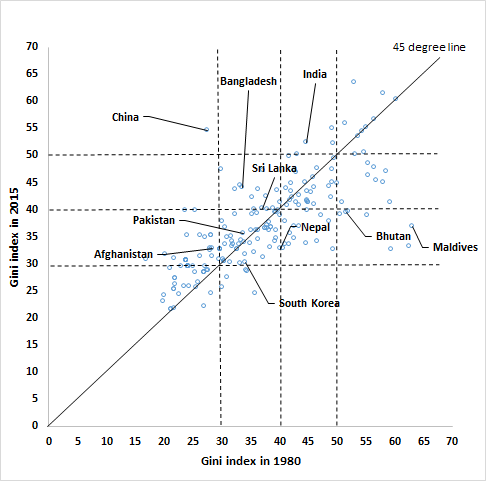
Using the WED 9.1, we have produced a scatter plot diagram with data on Gini indices for 207 countries in 1980 in the horizontal axis and data on Gini indices of the same countries in 2015 in the vertical axis. In the scatter plot, dots around the 45 degrees line are the countries with ‘no or very small’ changes in Gini indices during 1980-2015; dots above the 45 degrees line are the countries which experienced an increase in the Gini index; and finally, dots below the 45 degrees line are the countries which experienced a decline in the Gini index. Out of those 207 countries, 18 experienced ‘no or very small’ changes in Gini indices, 109 experienced increases, and 80 experienced declines. Among the 8 south Asian countries, 5 countries (Afghanistan, Bangladesh, India, Pakistan, and Sri Lanka) observed rises while the rest 3 countries (Bhutan, Maldives, and Nepal) experienced declines. We also brought China and South Korea into the picture, and it appears that the Gini index in China increased quite astonishingly, whereas that of South Korea declined.
We have also categorized the values of Gini index as follows: a Gini index value lower than 30 is considered low; an index value between 30 and less than 40 is considered medium; an index value between 40 and less than 50 is considered high, and an index value above 50 is considered very high. Depending on these classifications, we can observe some interesting movements of the South Asian countries during 1980 and 2015. Afghanistan moved from a status of low inequality to medium inequality; Bangladesh moved from medium inequality to high inequality; though Nepal, Pakistan and Sri Lanka remained within the medium inequality range, Sri Lanka was at the border of high inequality; India moved from high inequality to very high inequality, and both Bhutan and Maldives moved from very high inequality to medium inequality. In comparison, China moved from low inequality to very high inequality, whereas South Korea moved from medium inequality to very close to low inequality.
We also explored the factors affecting inequality in the cross-country and over time contexts. Results from a fixed effect panel regression suggest that while a rise in the real GDP per capita tends to have a small negative association with the Gini index, an increase in both life expectancy at birth and net secondary school enrollment is strongly associated with the decline in the Gini index. These suggest that an increase in per capita real GDP is not a guarantee for the reduction in income inequality, whereas investment in social infrastructure with the aim of raising the life expectancy at birth and a rise in secondary school enrollment can be very instrumental in reducing income inequality.
Reference: Solt, F. (2016). “The Standardized World Income Inequality Database”. Social Science Quarterly.


RECENT COMMENTS